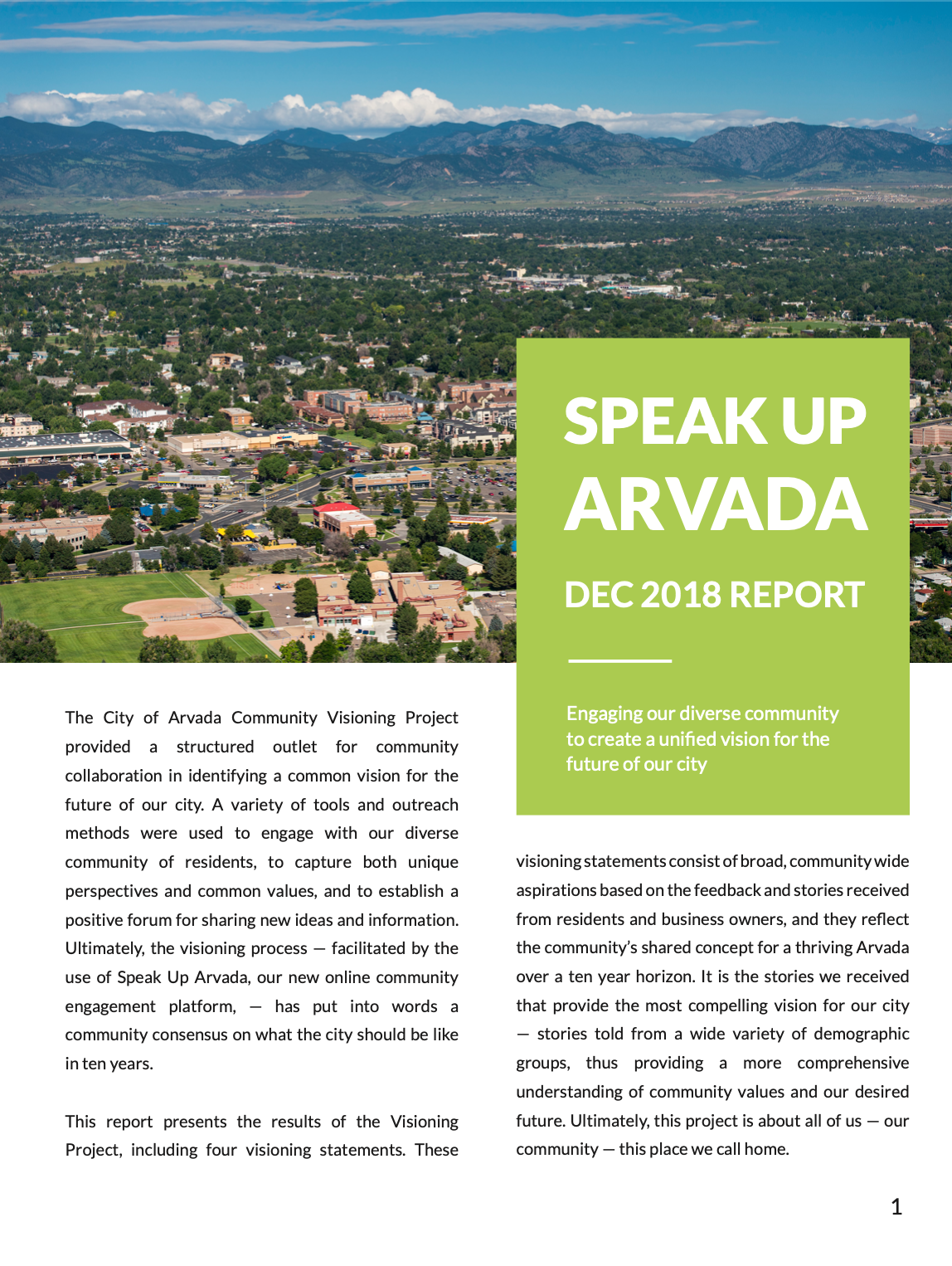
Speak Up Arvada
City Government Survey Report
Speak Up Arvada
City Government Survey Report


City Government Survey Report
City Government Survey Report
An engaging report to communicate city residents' visions of the future.
Illustrations to communicate community data
The city officials in Arvada, CO needed to report the findings from their surveys on the Speak Up Arvada website. They gave me access to excel sheets and a general outline, and I was tasked with creating illustrations for the intro and method sections, and maps and graphs for the data reporting and outcome sections.
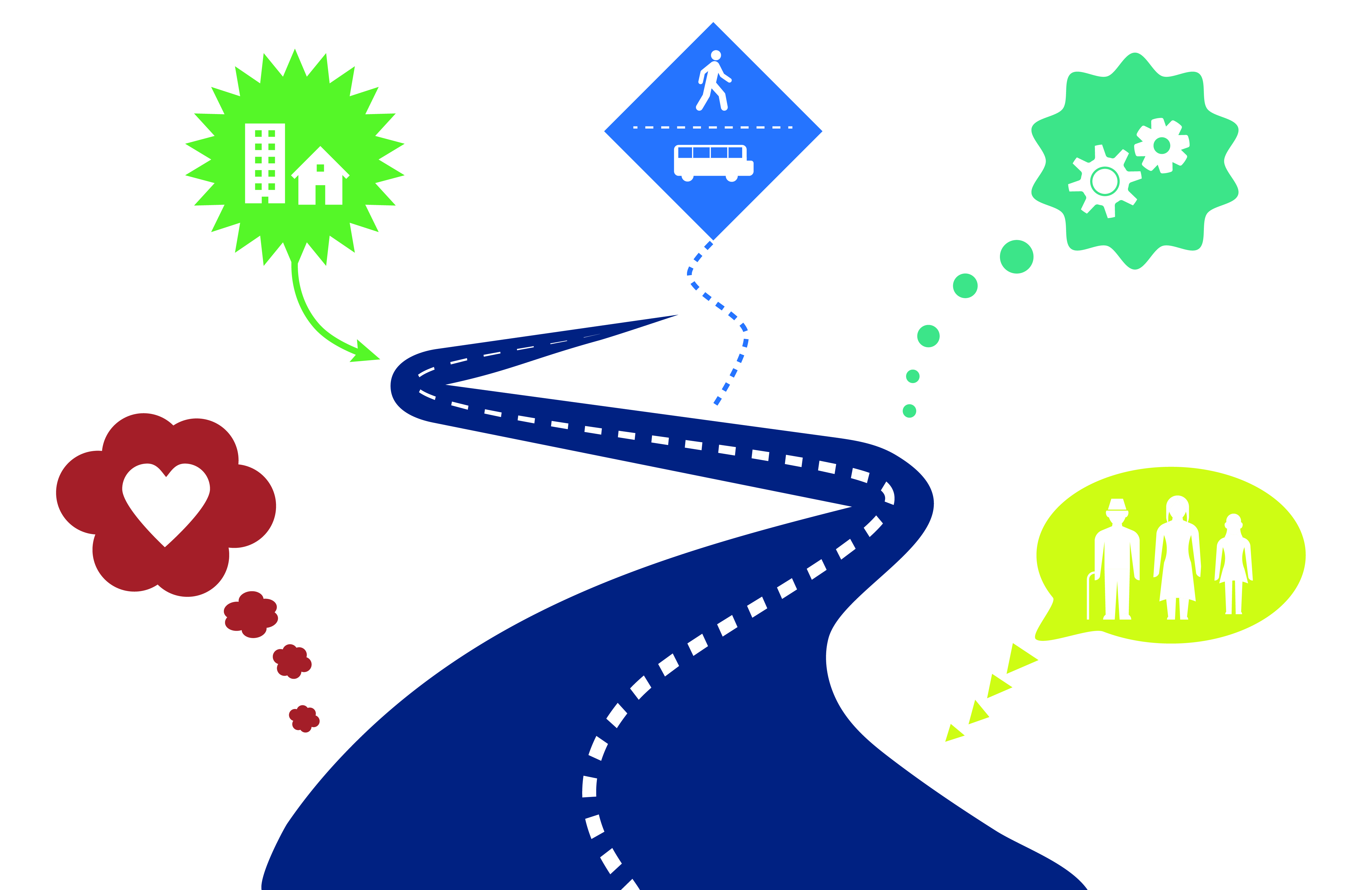
A fun part of the project was finding ways to illustrate the introduction and methodology section. This was a report for the officials in the city government as well as the citizens of the city. The report was supposed to reflect the vibrancy of the city and the community's visions of the future.
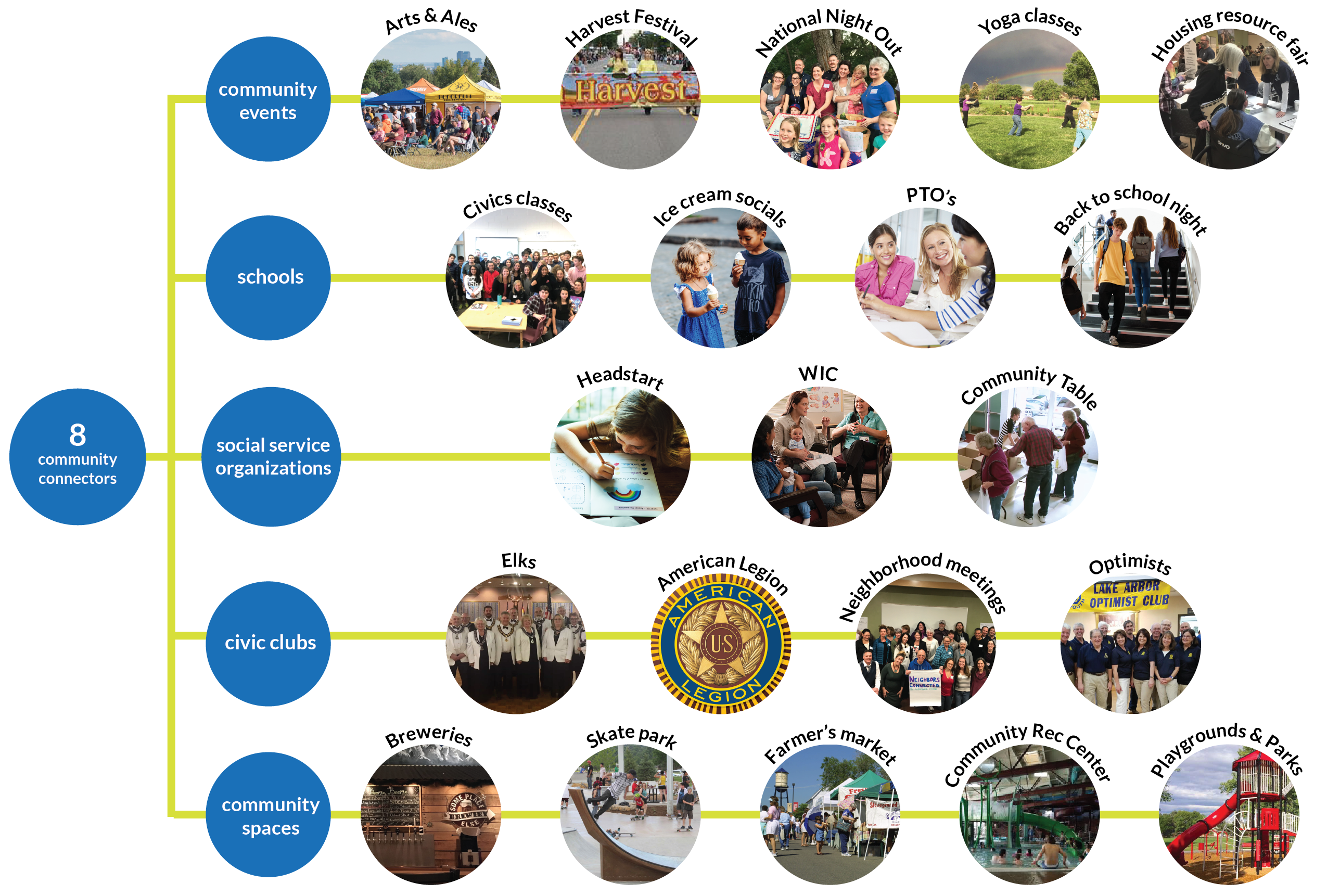
The graphic on the left particularly shows the character of the community by using photos from around town that are instantly recognizable. It shows the effort of the outreach program to interact with all members of the community, regardless of age, socio-economic status, gender, language, and other identities. The colors reflect those used by the Speak Up Arvada campaign.
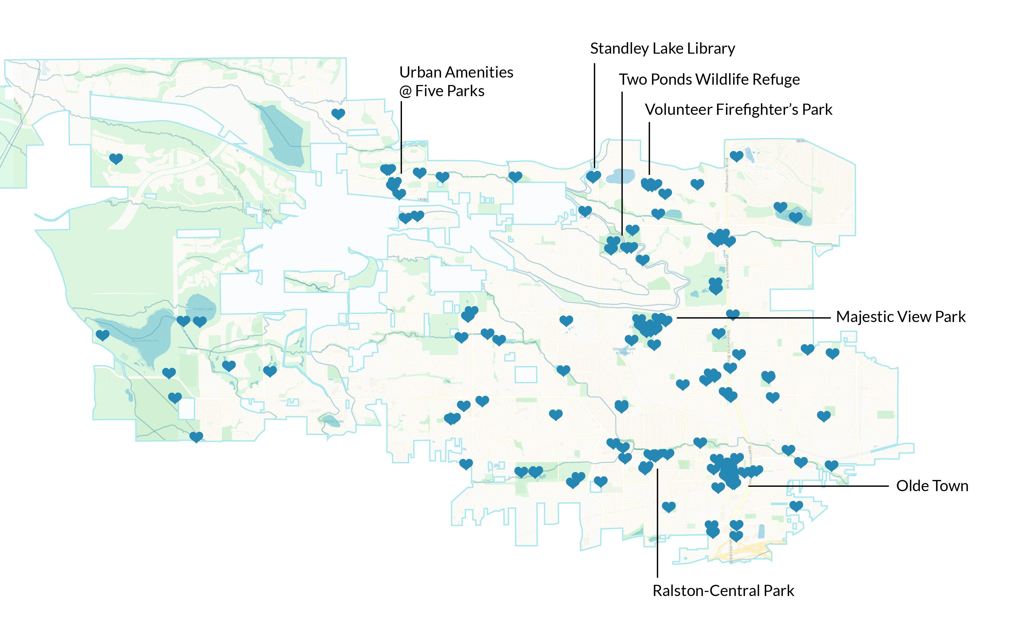
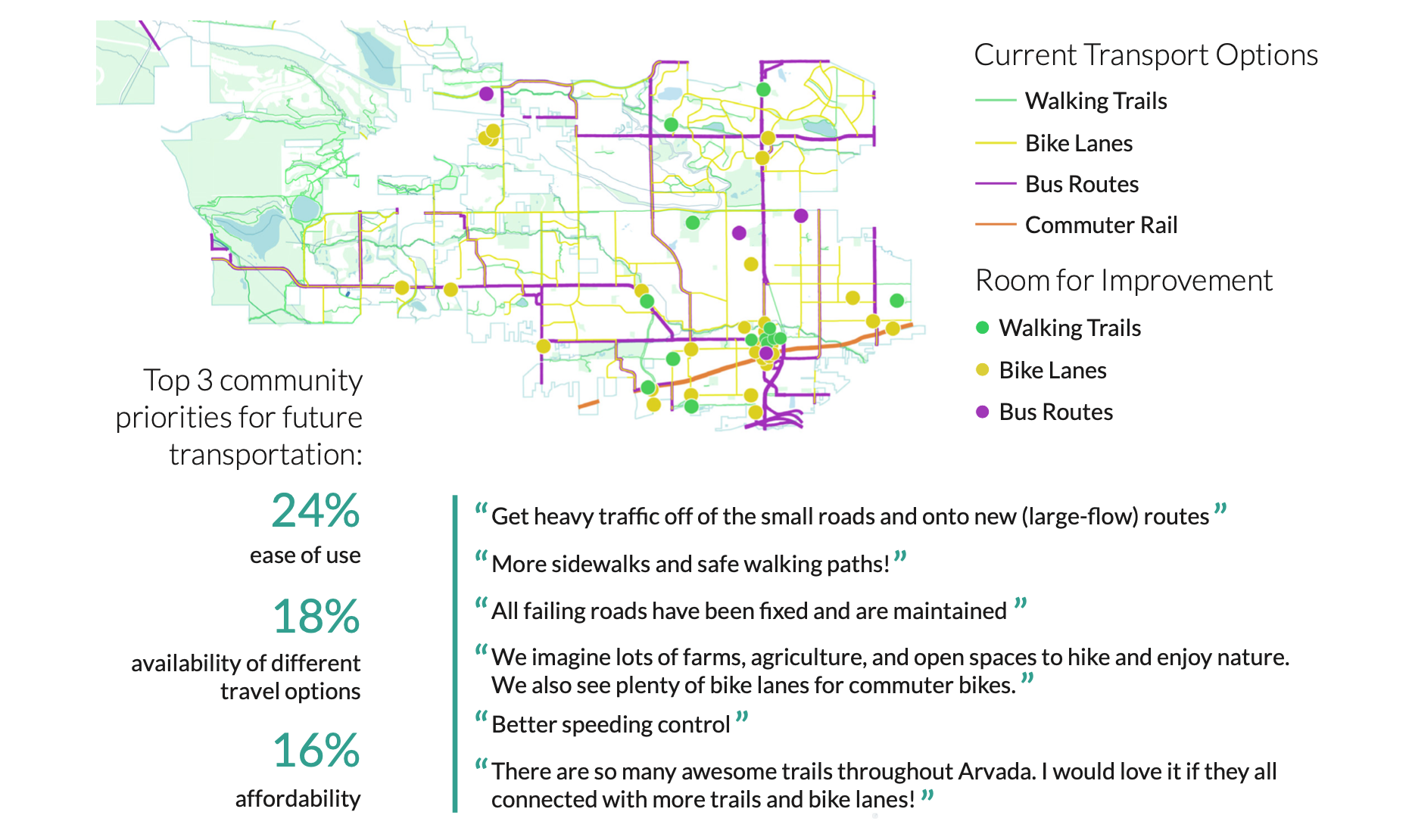
For overall visions for the city of Arvada emerged from the survey. To summarize: 1. An inclusive small town, 2. Safe neighborhoods and community spaces, 3. Effective transportation network, 4. Responsive municipal services. To illustrate the second point, I created a map with the communities most loved places. For the third point, I mapped the current bus and train routes plus walking and biking paths, overlayed with areas community members pointed to as areas that need improvement.
After arranging the copy I was given by the City of Arvada employees and adding photos of the communitiy, we had a finished report.