Healthcare Graphics
Long-term follow up for different treatments
Healthcare Graphics
Long-term follow up for different treatments


Long-term follow up for different treatments
Long-term follow up for different treatments
A collaboration with scientists at Brigham and Women’s Hospital and Dana-Farber Cancer Institute.
Multidimensional data that couldn't be summarized.
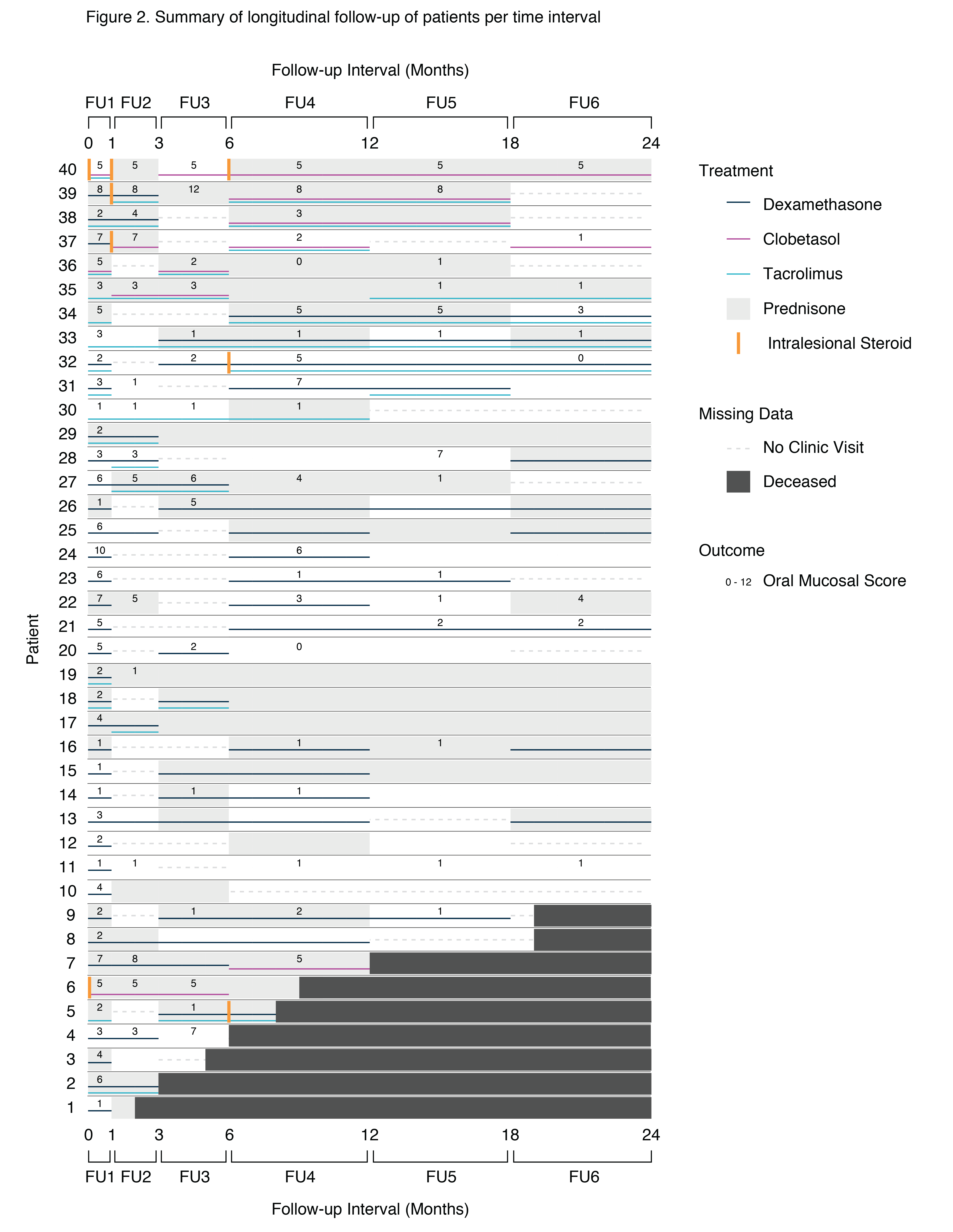
A challenging aspect of this project was that it wasn't a typical drug study. It was a long-term follow-up of oral graft-vs-host disease patients, treatments were assigned according to doctor opinion, and patients were not required to visit the doctor at any time. The goal of this study was to document long-term treatment and access that use of topical treatment over a long period is safe for patients.
First off, the data could not be summarized since there was no control data and no standarization. Patients were all different ages, at all different stages of illness. They visited the doctor at different intervals, stopped visiting the doctor completely, or died during the two-year follow-up. They were prescribed different topical treatments, and mixtures of treatments, including non-topical treatments.
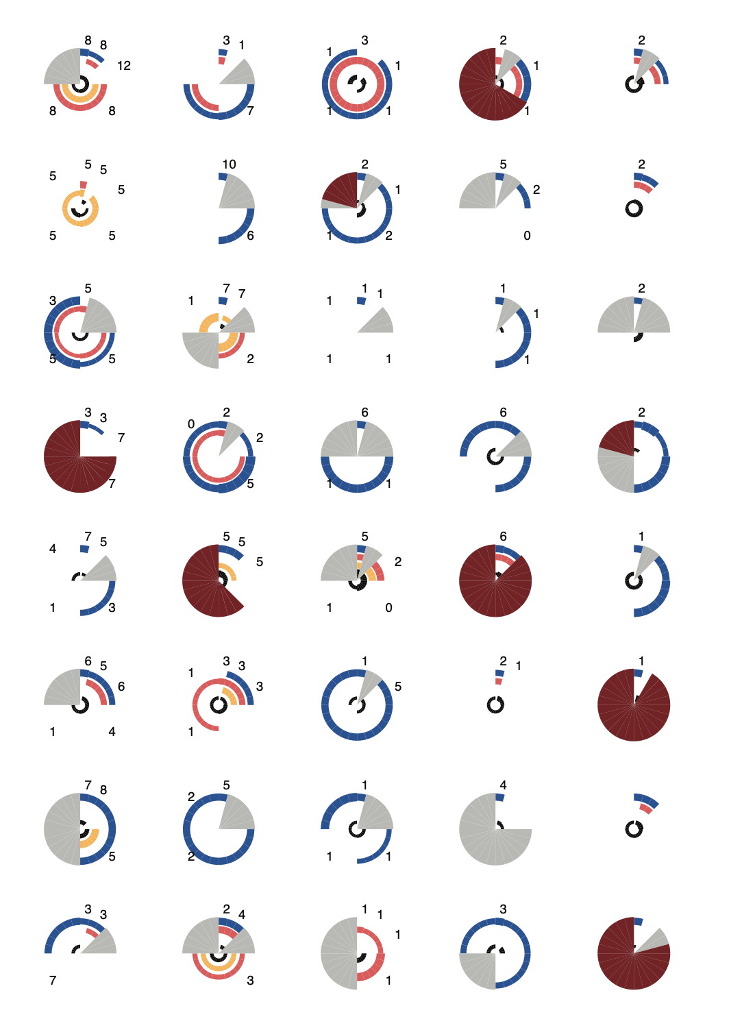
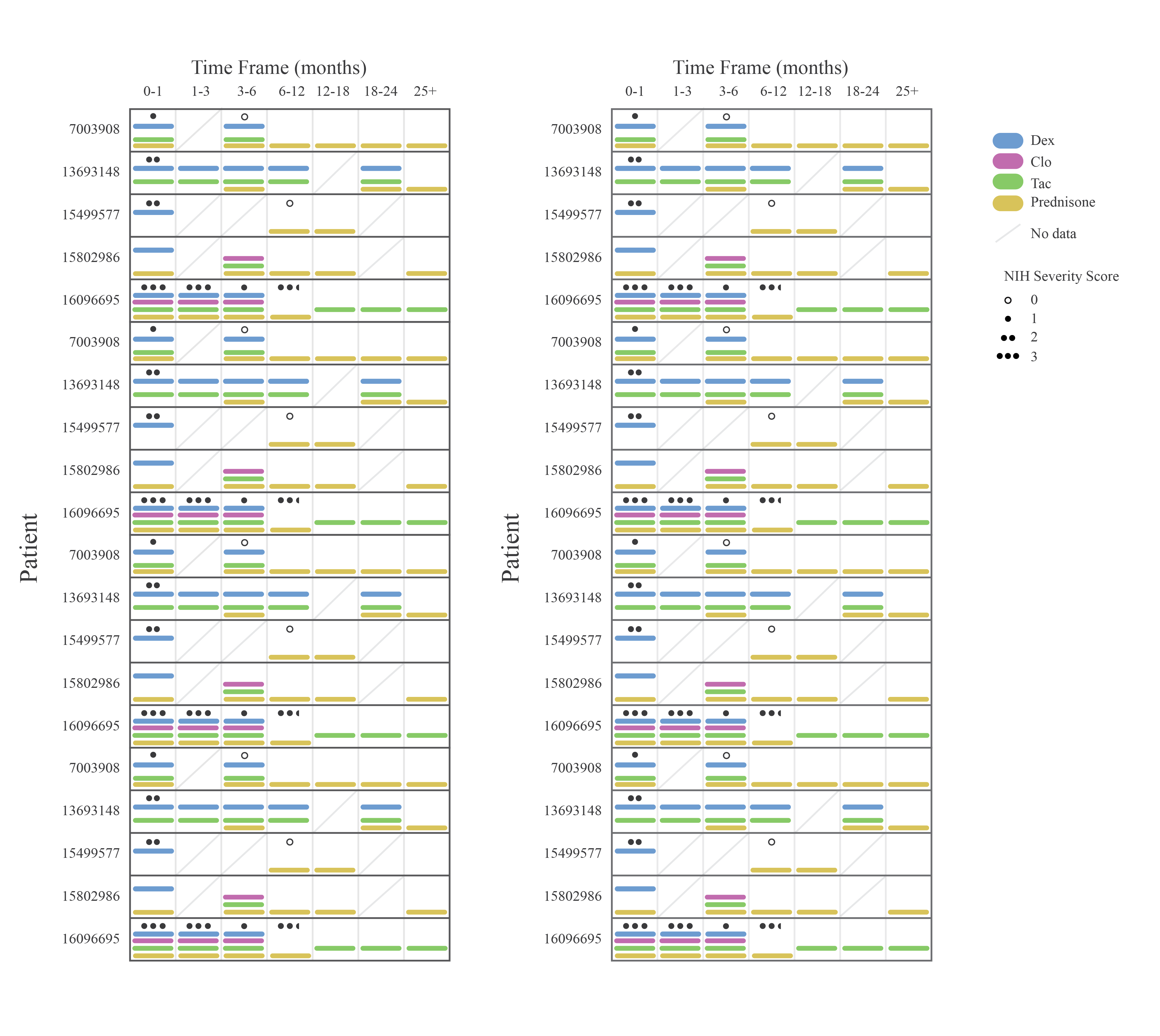
The structure of the data meant that was high dimensional and all of it needed to be displayed in one graphic. Dimensions were time (interval), any combination of three topical treatments, a pill, and an intralesional steroid, whether the patient visited the doctor or not, was deceased or not, and a doctor-assigned outcome score. These all needed different, but complimentary symbology.
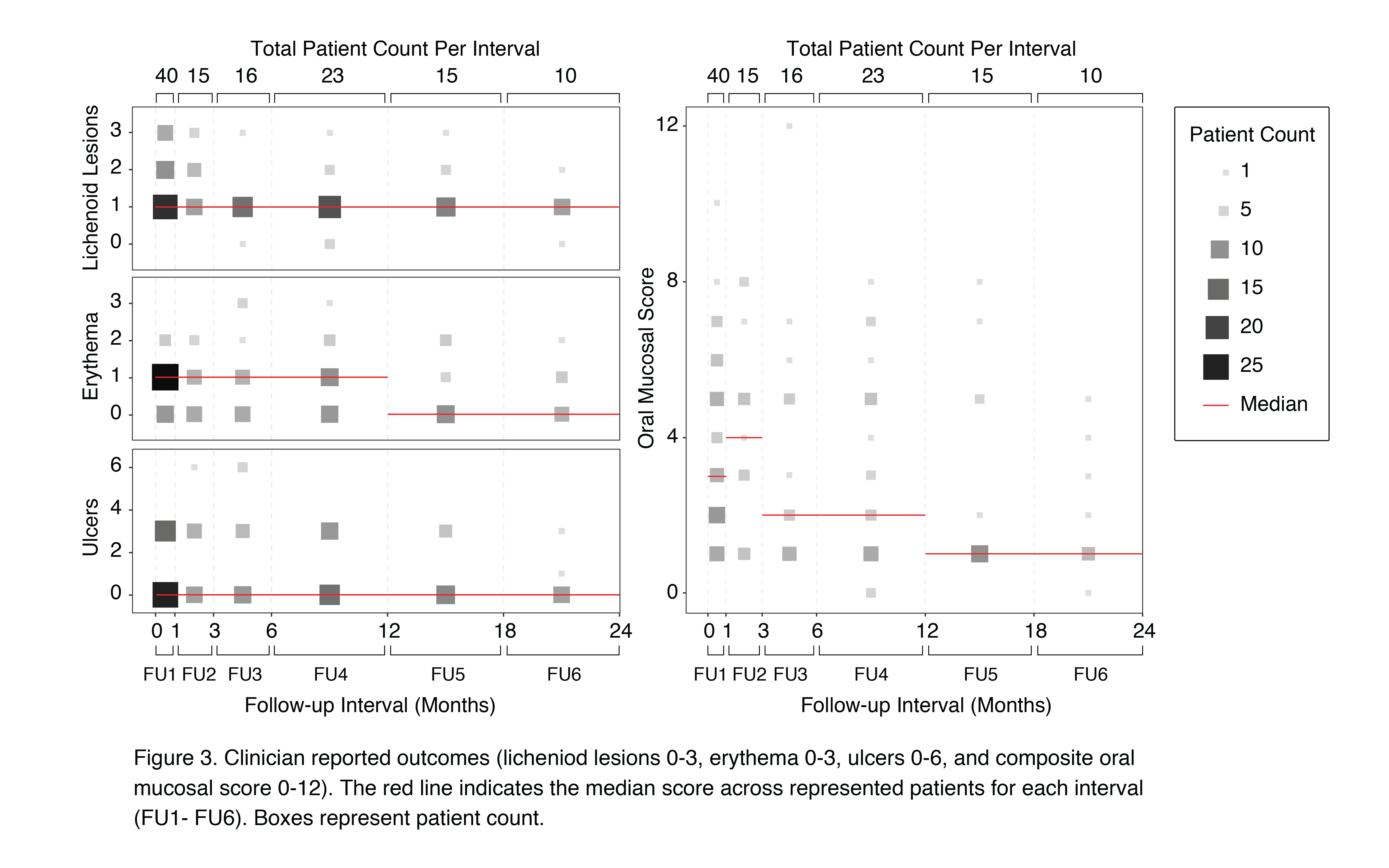
Besides the main graphic, others were included to summarize outcome scores - as best as we could. I learned a way to display the trend of scores by grouping patients into their time interval and score level.
After creating tables and editing the text and responding to reviewers, our manuscript was published in Biology of Blood and Marrow Transplantation.