Tipping Point App
Tool to Explore Missing Data
Tipping Point App
Tool to Explore Missing Data


Tool to Explore Missing Data
Tool to Explore Missing Data
Missing data can make analyzing experimental data tricky.
This tool allows scientists to explore their data to ensure missing data does not affect their conclusions.
Develop an interactive Shiny App & R package that displays the effect of missing data.
Don Rubin, creator of the Rubin Causal Model, was interested in expanding an existing R package that helps experimenters explore missing data. One use case is for drug trials, when people may drop out for many different reasons. Based on assumptions made about the outcome of these people, the hypothesis could be mistakenly accepted or rejected.
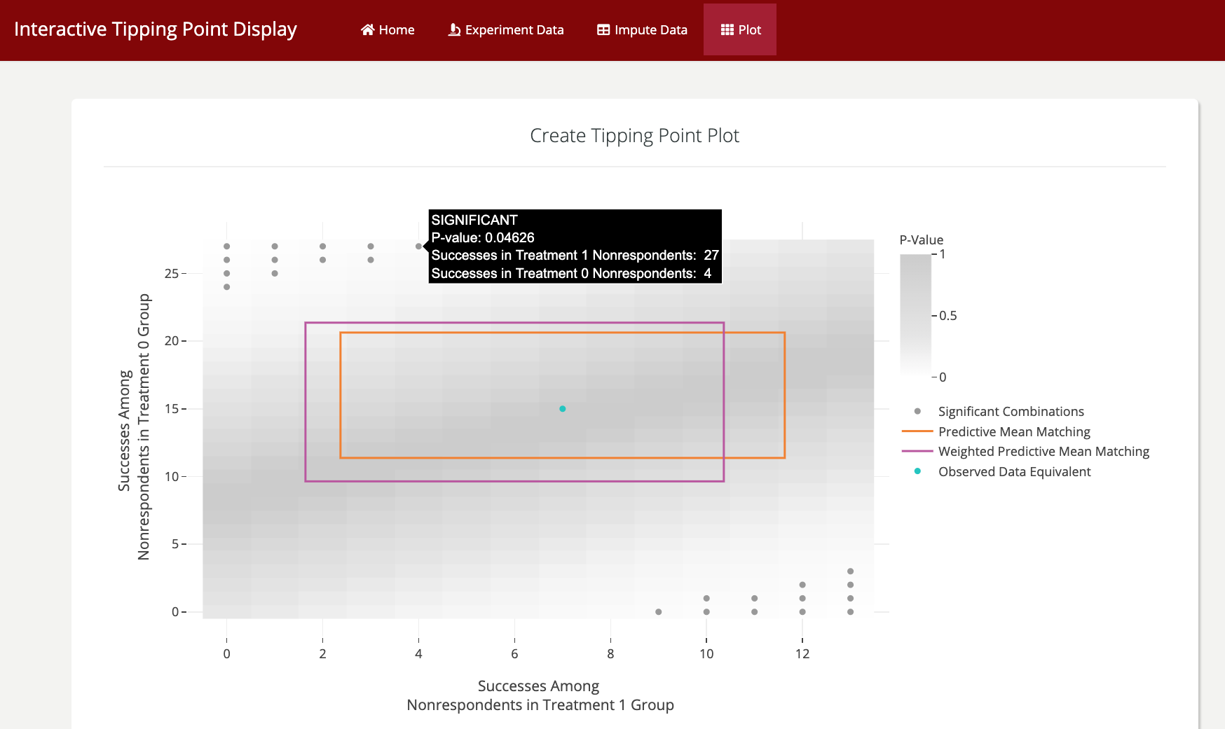
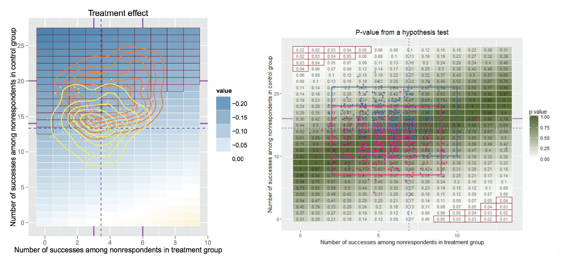
The current Tipping Point R package displays every possible combination of outcome in the missing participants and the treatment effect and/or p-value of assuming each combination to be true. Arguably the most important part of these plots is to show the likely combinations as predicted by historical data and multiple models, so the researcher can narrow down the missing data combination possibilities. The current plots can be difficult to interpret and most importantly are missing information about the imputation models. The goal was to make these plots more aesthetic, clearer, and include more data, specifically about the models.
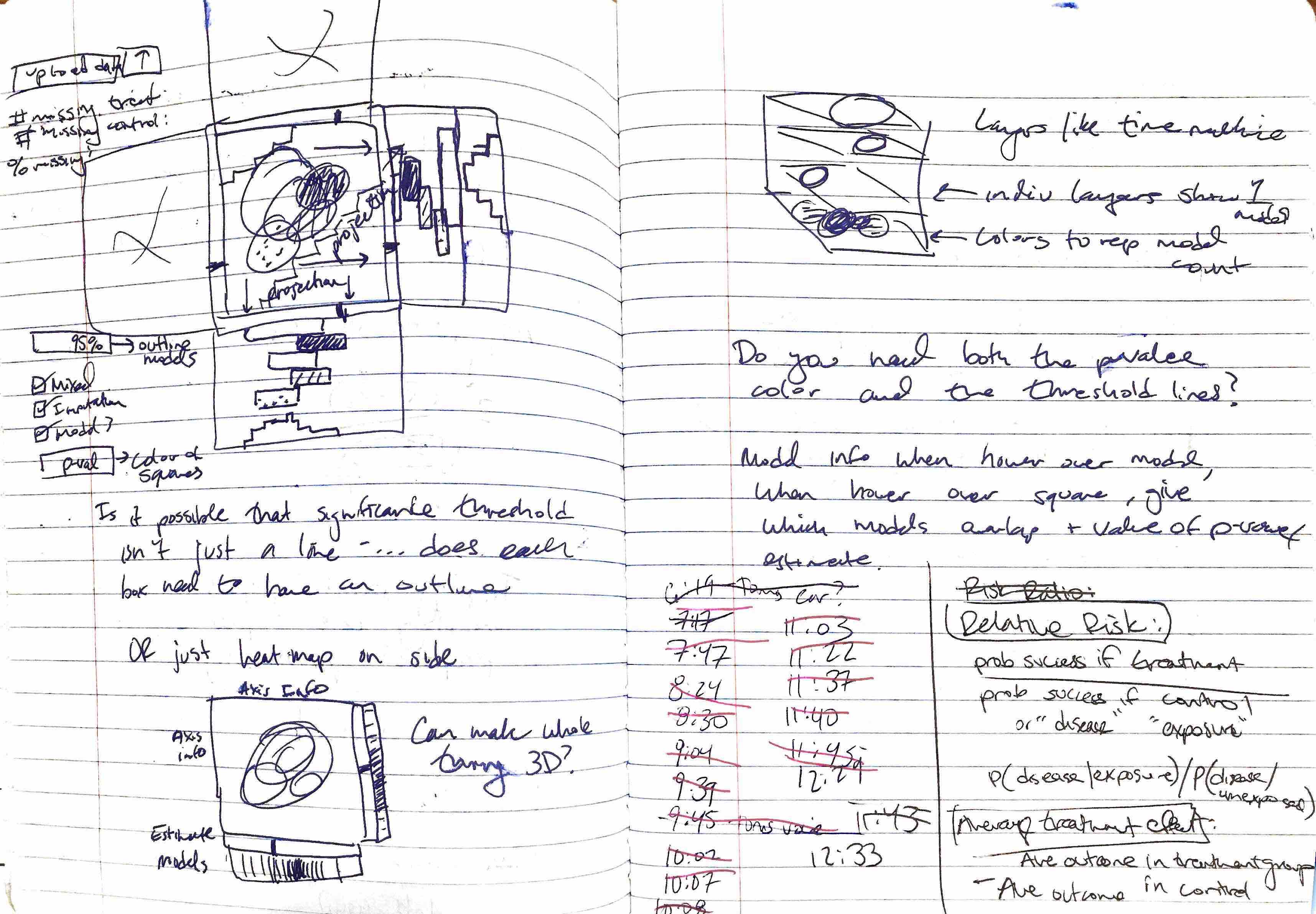
I brainstormed a number of different ways to display the data but ultimately decided the grid setup was the most direct way to display all of the combinations of assumptions that could be made about the binary outcome of people in the treatment and control groups.
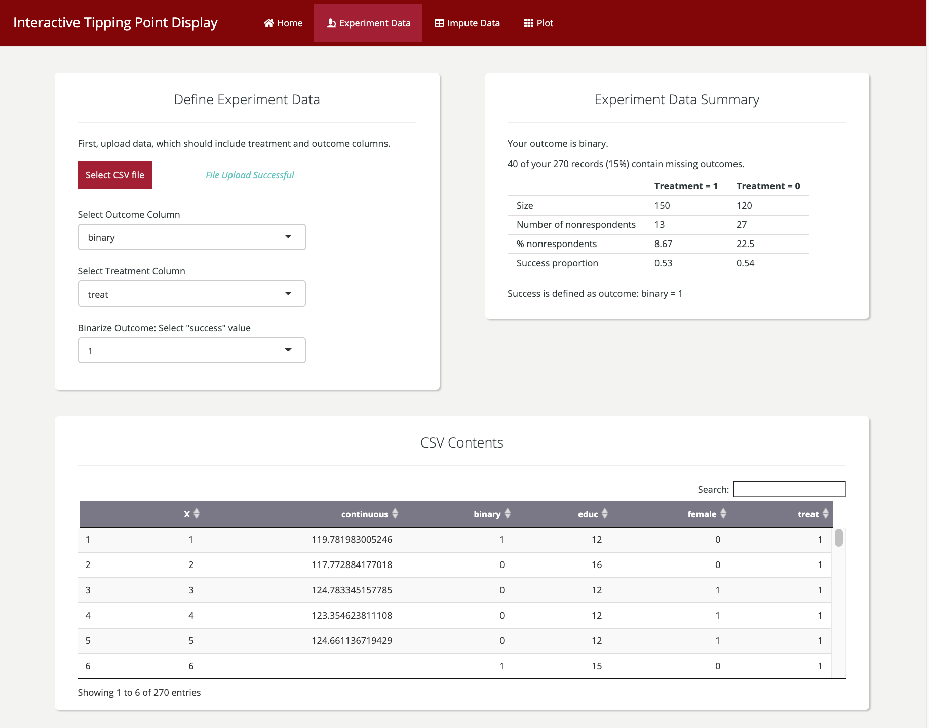
Shiny allows for multiple tabs that can be used to give step-by-step instructions, sample data, and interpretable summary statistics.
The R package Shiny allows us to update the existing package to allow for interactive inputs. Users are guided through uploading their data, subsetting the columns of interest, and choosing the aesthetic qualities of the plot.
In the original Tipping Point displays, the heatmap color is made redundant by the numbers in the matrix, and the red box borders showing significance. I’ve simplified the color the heatmap takes in order to draw more attention to the model outlines. There were a lot of outlines with both the significance box borders and the model credible regions, so I changed the significance symbology to be a circle within each matrix square with a significant p-value.
The tooltips that Plotly allows are the real stars of the show. They provide information about any cell or model the user hovers over. This satisfies the main mission of this project: to make the visualization more user-friendly, and allow for many models (colorful outlines) to be displayed.
There are still a few bugs to smooth out, but then we'll launch the app online, as well as in a R package.