
VocaliD Graphics
Over 40 website graphics & icons

VocaliD Graphics
Over 40 website graphics & icons
VocaliD, a startup that makes custom digital voices, is a main client of Datascribe's.
They recently launched a new website and needed multiple graphics for every page included in the new website - over 40 graphics total.
Develop consistent & relevant graphics that convey AI expertise & an artistic flair.
VocaliD's new website needed to appeal to their primary market base - people who use computers to speak (think Steven Hawking) who want a voice that sounds more original, as well as financial institutions and corporations that may hire VocaliD to test voice biometric systems or put in large custom voice orders. The graphics needed to speak to both traditional, no-frills management, and individuals looking for hope in technology. Data art was the immediate direction we chose to pursue.
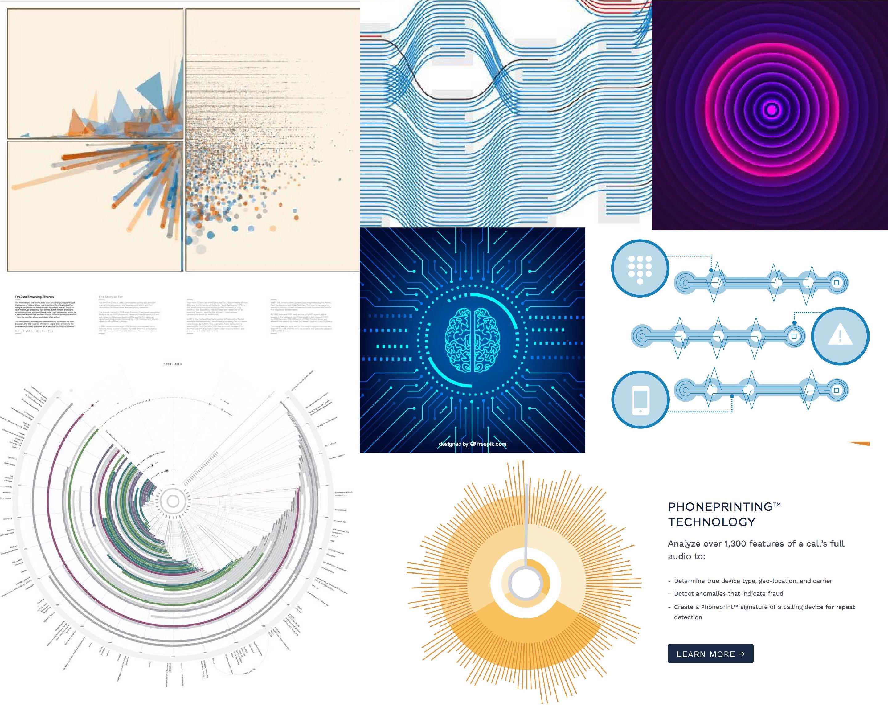
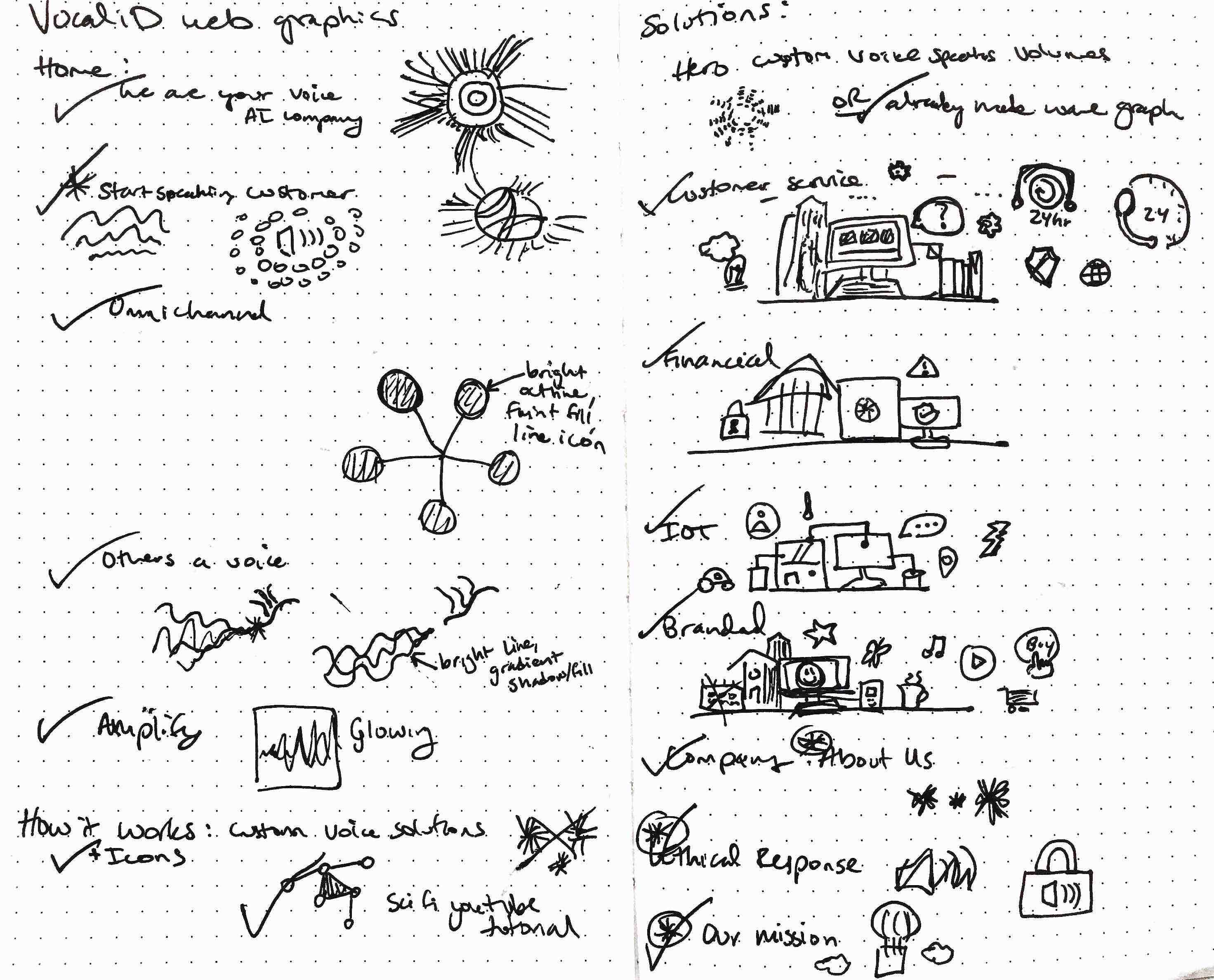
First I gathered images to make a moodboard to ensure the theme was what VocaliD was looking for. Then I made a list of all the needed graphics and sketched an idea for each, treating this as a checklist for the project.
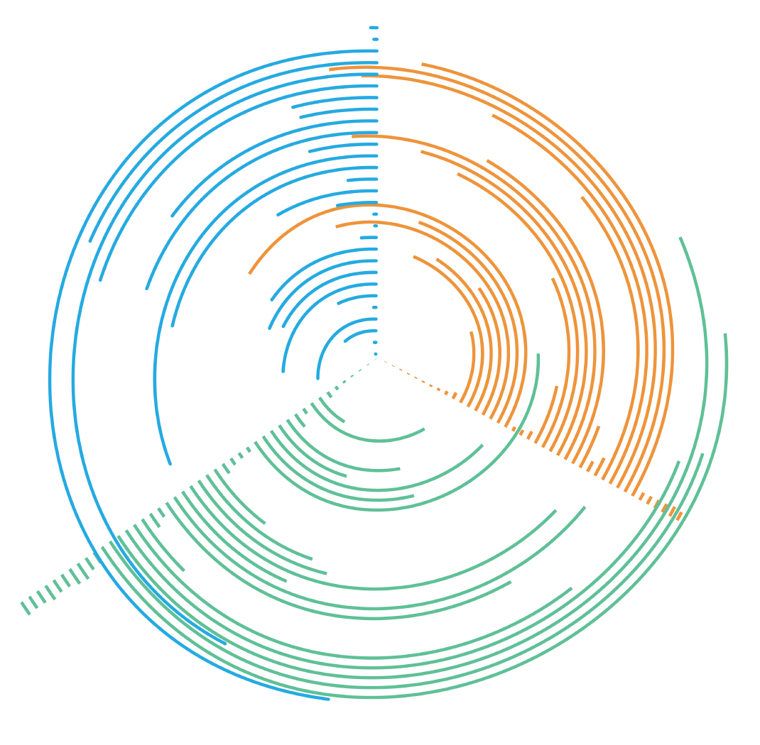
8 employees from VocaliD submitted recordings saying, "We are VocaliD. Your voice AI company. Bringing things that talk to life." These waveforms served as the building blocks for many of the graphics on the page.
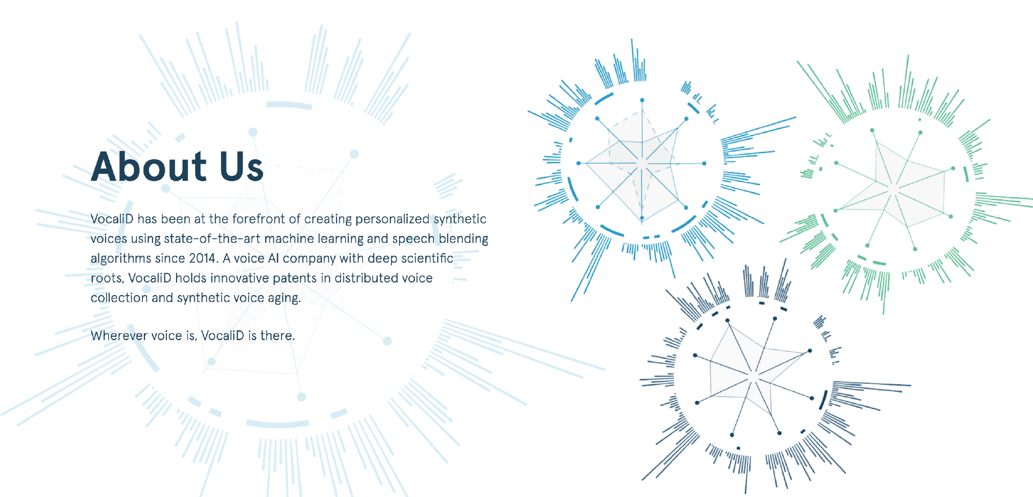
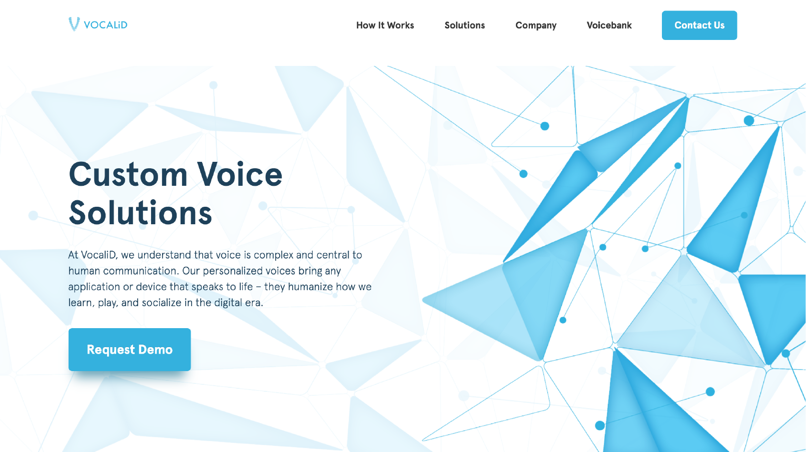
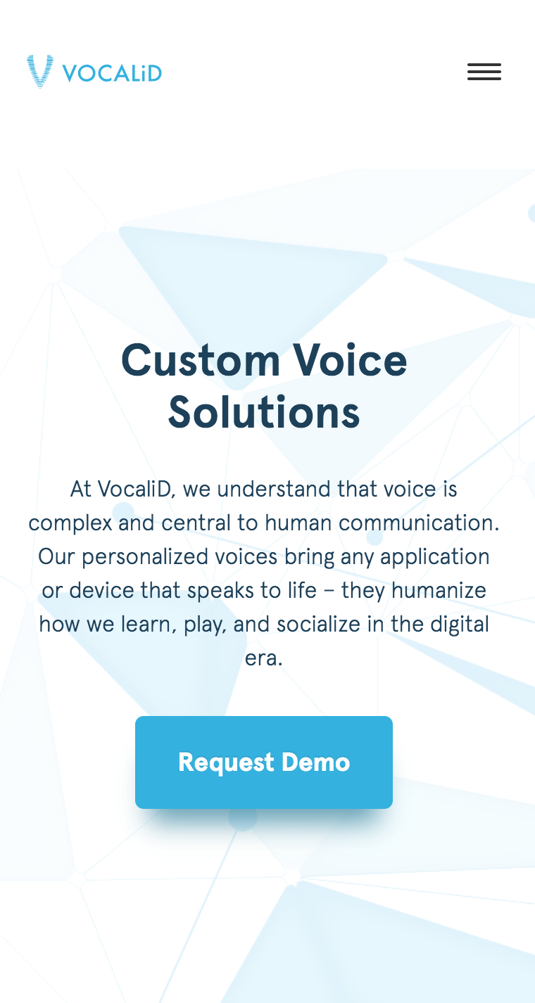
The hero images for each page had special responsivity concerns. The text needed to be readable, so the graphic needed to be subtle under the text, but more eye-catching in areas where the text wouldn't be. These images are the finished product as seen from a desktop and a phone screen.
To offset the colorful nature of the data art, I stuck to simple navy line designs. I added more detail than the typical small icon since these would have a moderate amount of real estate on the webpage.
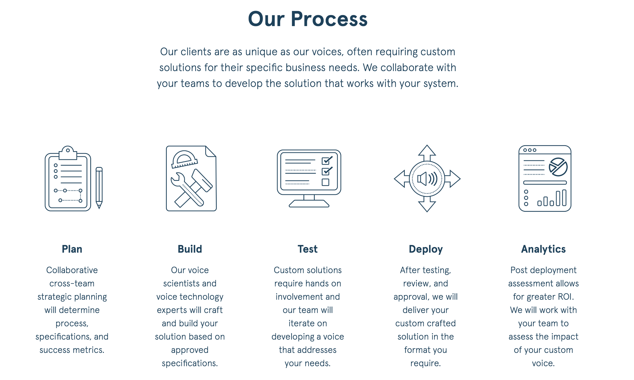
The illustrations that required more creativity were the hardest parts. Data art can be fairly straight-forward, as long as the color scheme and textures are consistant with the brand. Graphics that illustrate nearby text can be challenging because there are so many options, so much room for creativity.

