Risk Mapping
Design adds value
Risk Mapping
Design adds value


Design adds value
Design adds value
Zoba has a great engine to predict spatial events in cities,
but when they needed to sell their product, potential customers remarked on the design more than the functionality. They needed a design upgrade.
Design and help implement a flexible platform to interact with spatial data.
Zoba began by predicting risk in cities, for law enforcement and insurance applications. They then realized their product could be used to predict all kinds of spatial data. The algorithms were top-knotch and needed an interface to match.
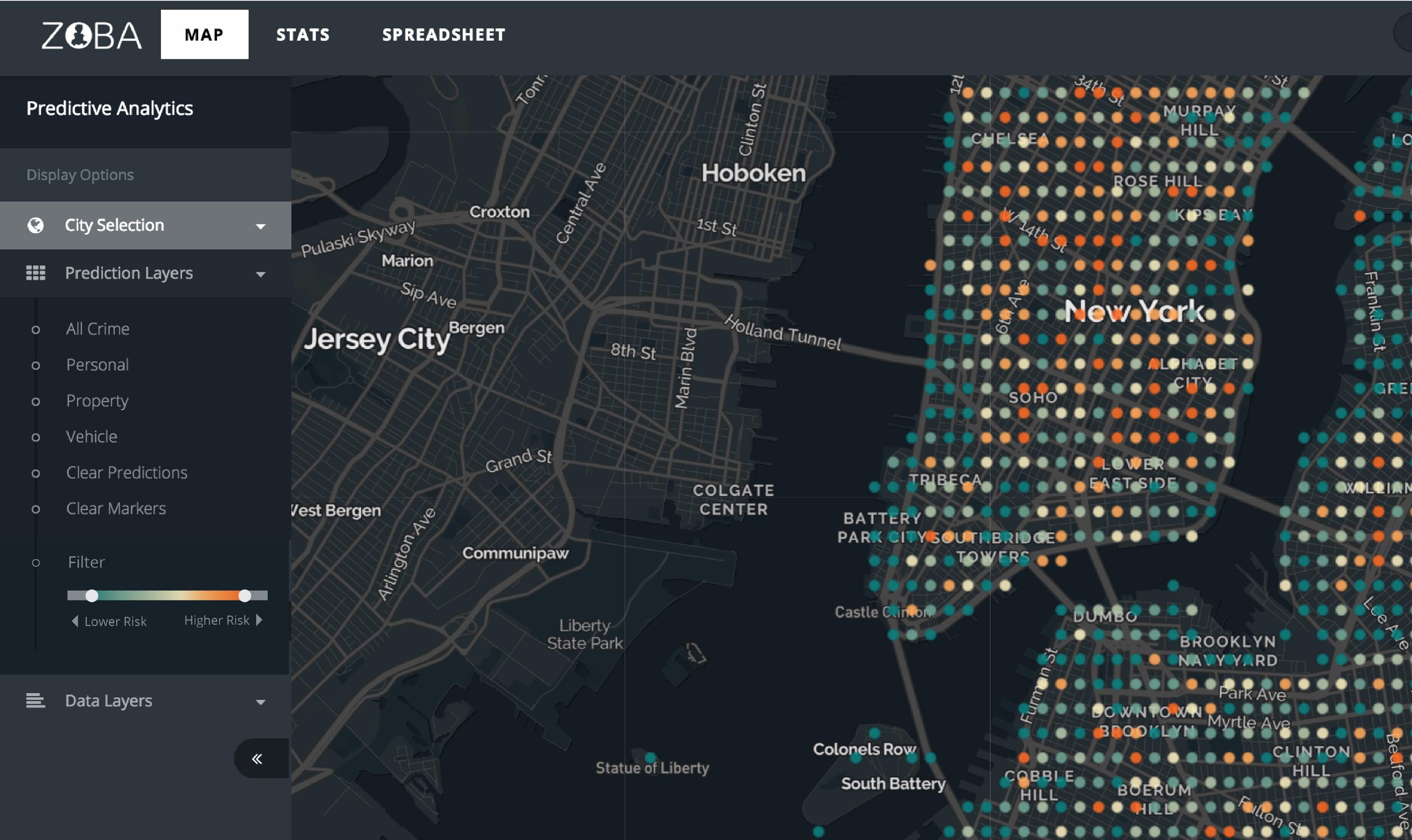
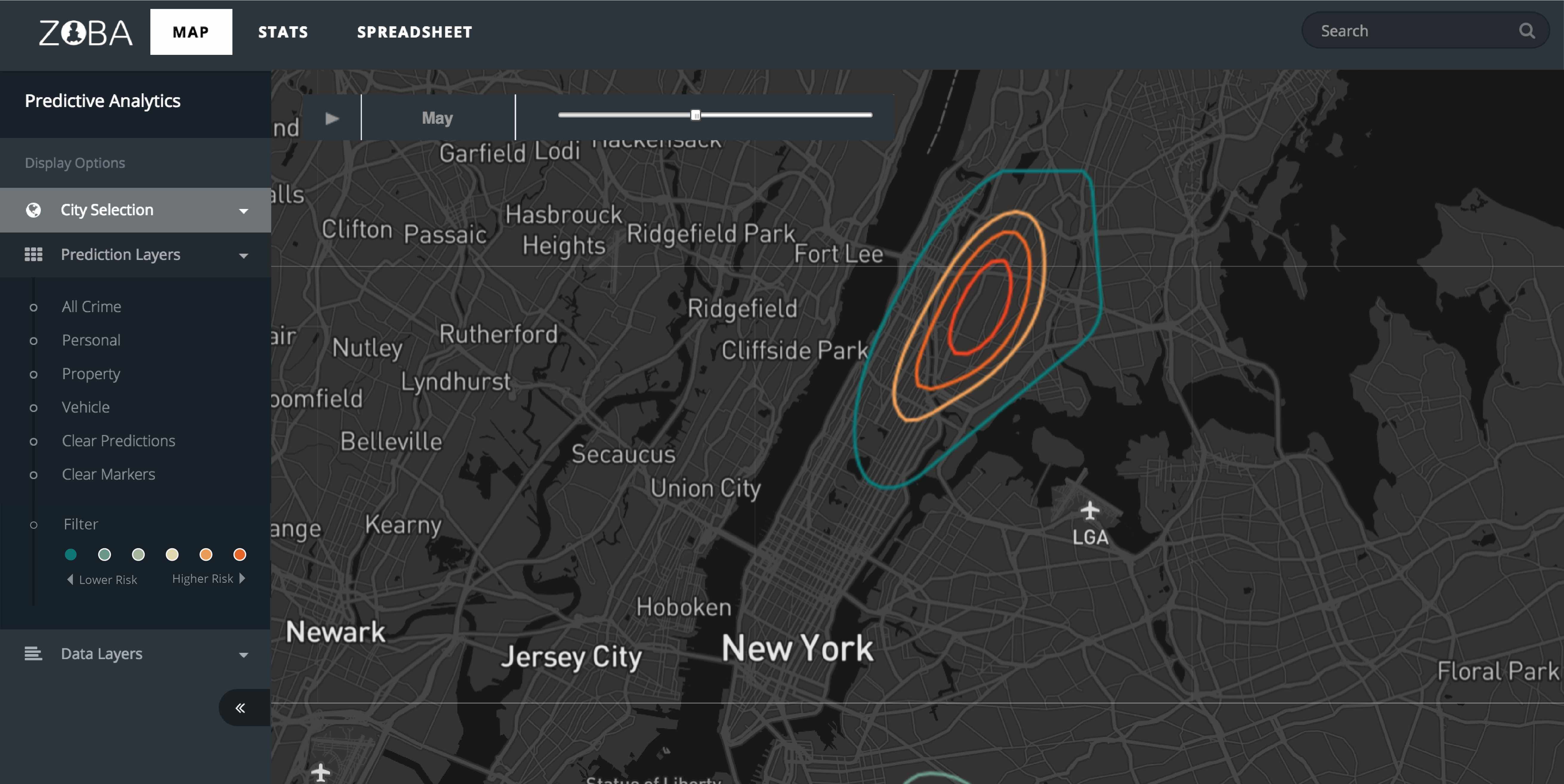
Zoba needed to redesign their web application to match the innovation of the algorithm behind it. I proposed changing their color scheme from light (which I unfortunately don't have a image of) to dark as inspired by some of my favorite maps. I also made a plan for all the additional layers that would have to be displayed to give the viewer context.
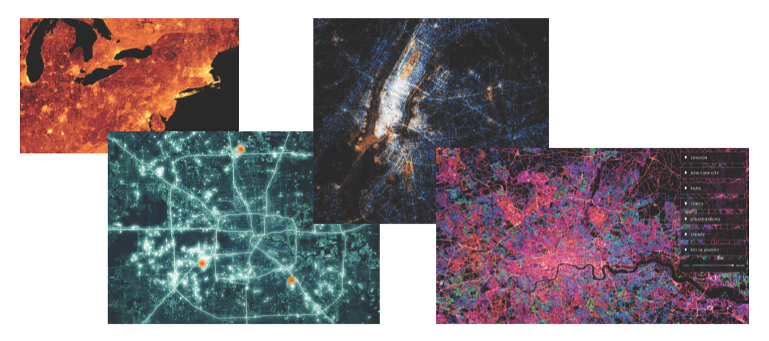
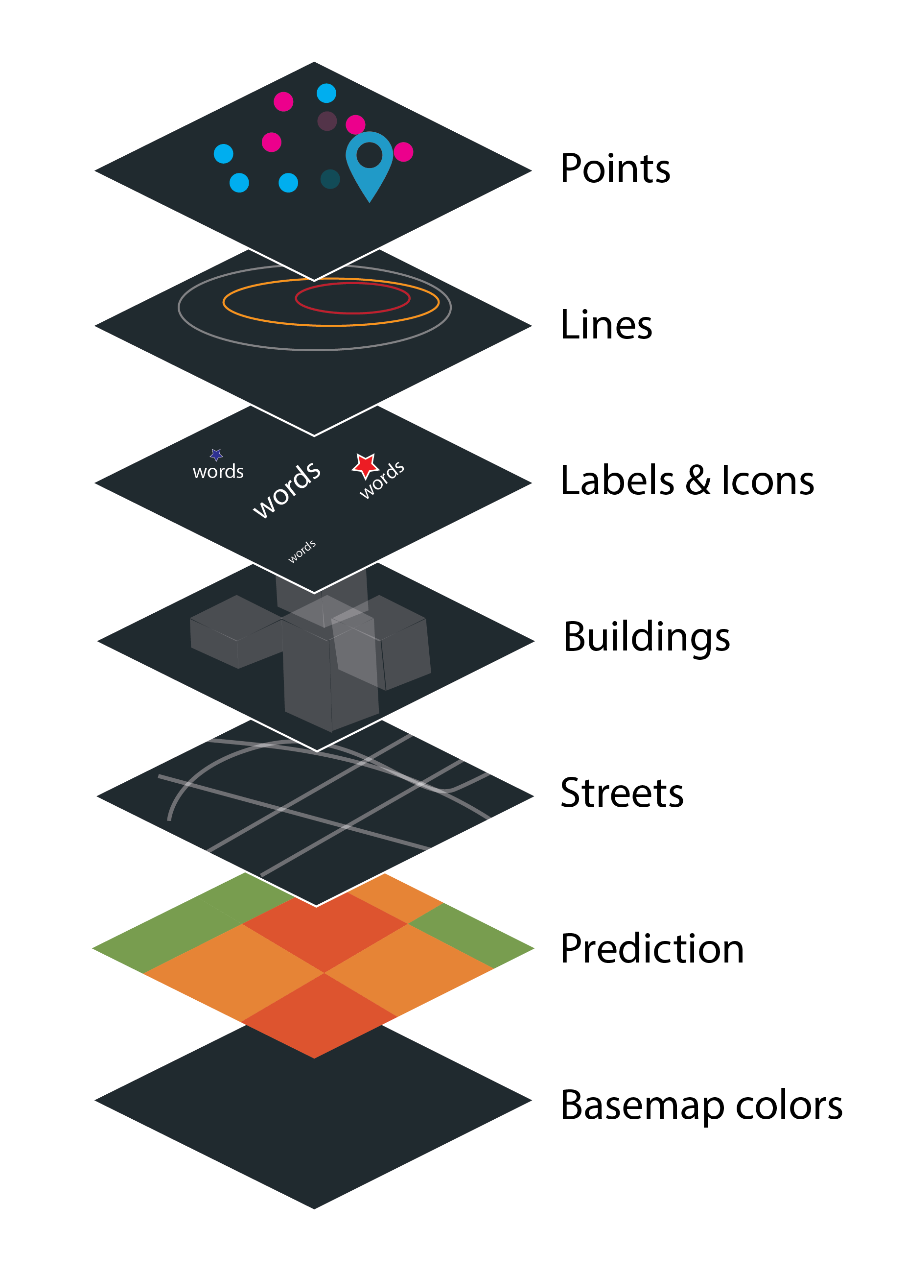
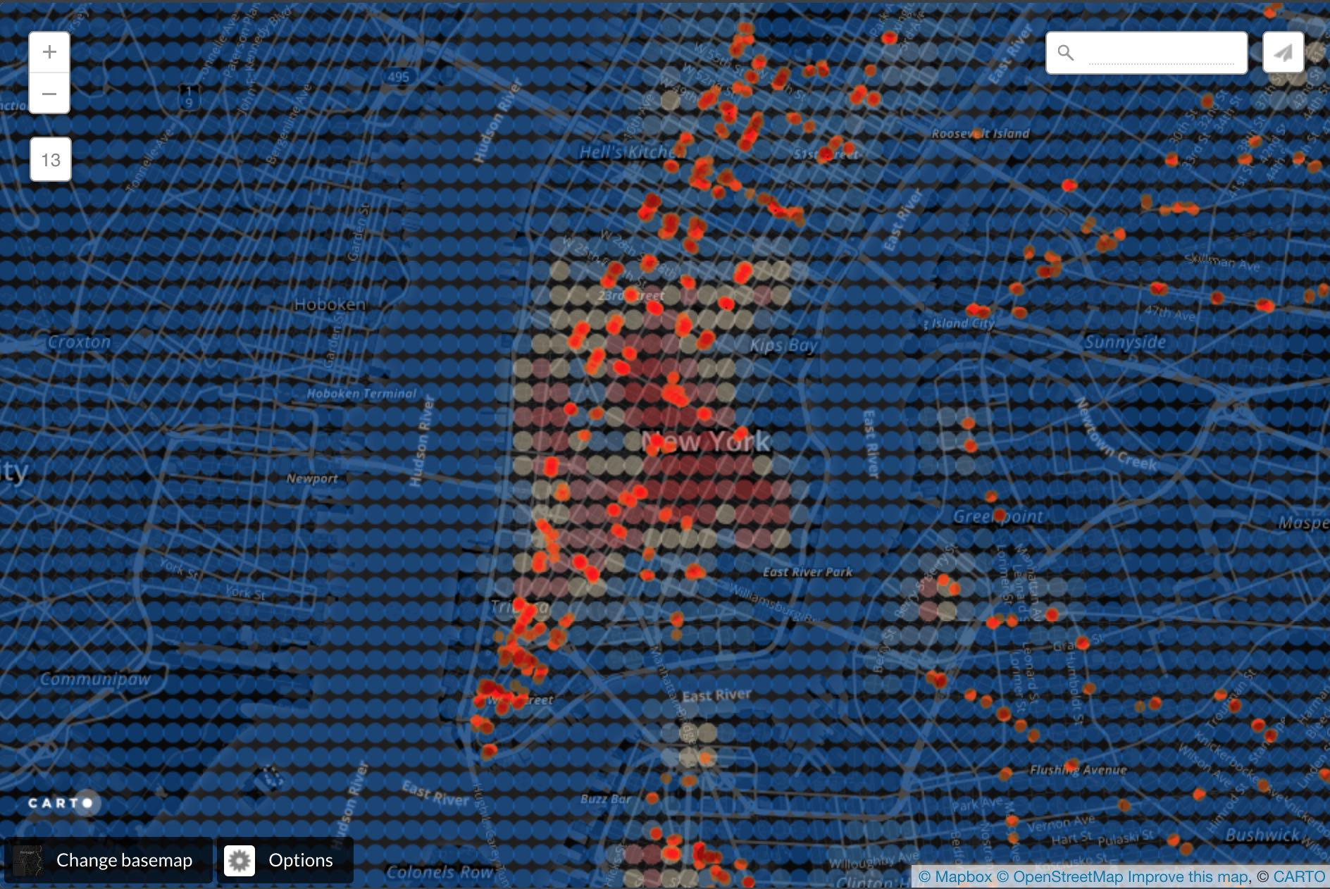
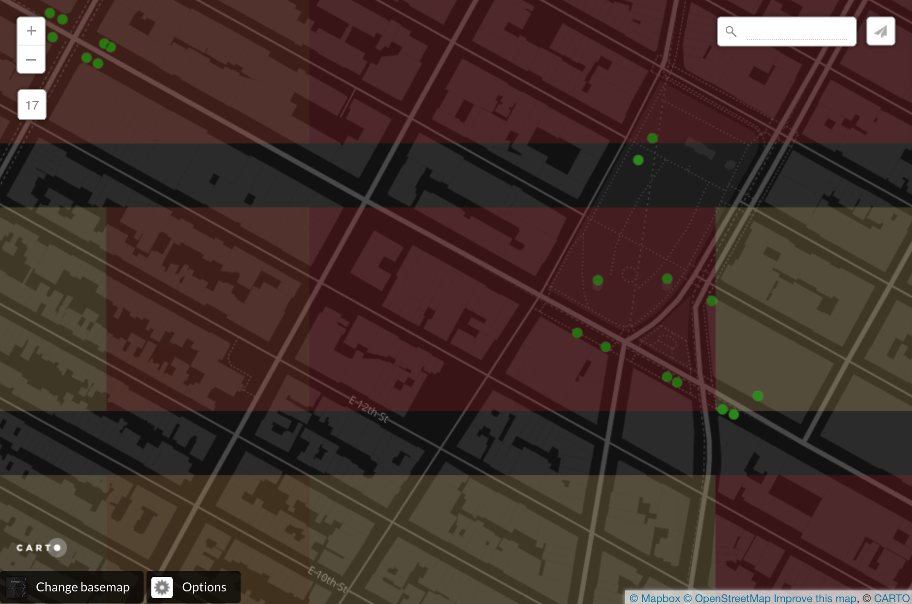
A major part of my job was to decide on the optimal symbology for all the layers. I worked in Mapbox and Carto to create a custom basemap and symbology for the points, contour lines, and areas that Zoba wanted to show, ideally all at the same time. I tried many combinations and some are shown here. One of the biggest changes was chaning the predition symbols from circles to squares that would lie below the rest of the map information. I worked in python to make a first implementation of the square symbology.
Besides the symbology, I also made a plan for the interaction panel. I assessed the tradeoffs between making it understandable and easy to use with providing the users with all the customizability they would want. The users would need to select the city, which layers to make visible, and filter the numerical layers.
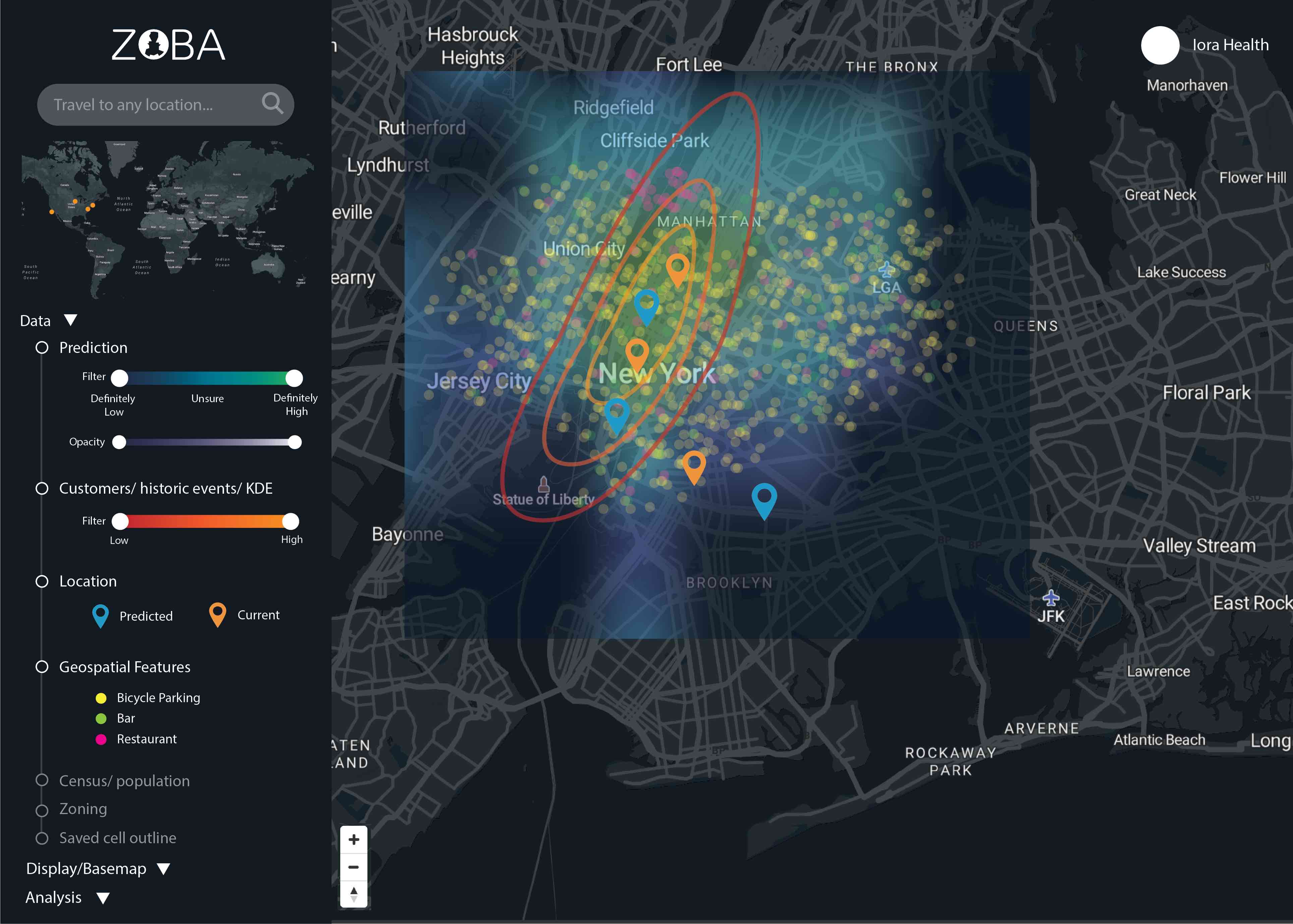
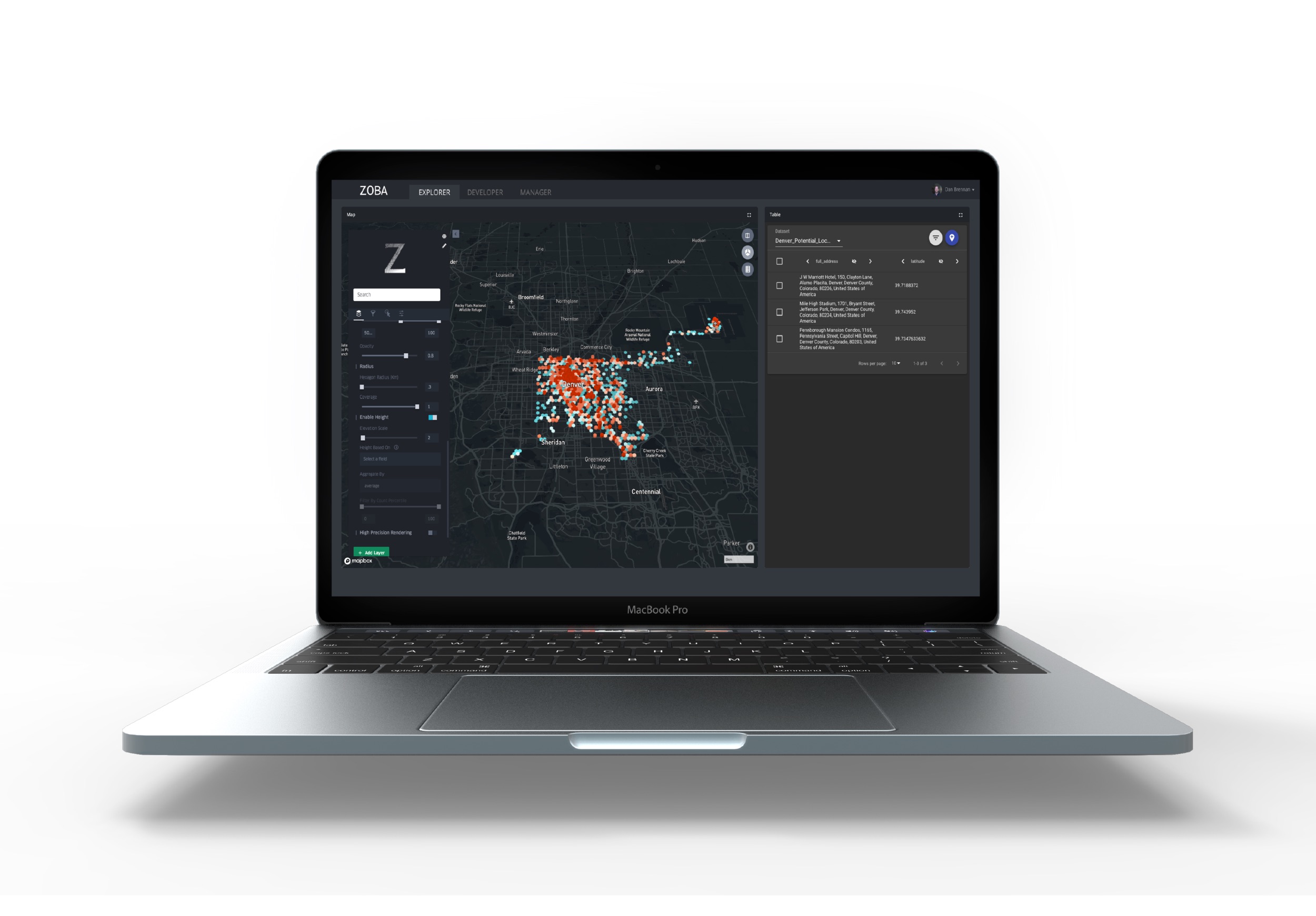
Zoba implemented my suggestions and became quite successful pitching to all sorts of companies and government organizations. The following image is the current mockup they present on their website.